Asteroids and Interactive Visualizations
The Aquarius Project at Adler Planetarium
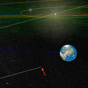
Quote from The Aquarius Project’s online field journal: On Monday, February 6, 2017, around 1:30 a.m. CST, a sonic boom shook residents of the Midwest as a bright green fireball streaked through the night sky. The sound was that of a meteor, nearly the size of a minivan, entering our atmosphere. After its fall to Earth, radar spotted the end of its journey over Lake Michigan, approximately 10 miles off the coast of Sheboygan, Wisconsin. Teen explorers from Chicago, led by scientists from the Adler Planetarium’s Far Horizons program, The Shedd Aquarium, and The Field Museum, team up to take on this Underwater ROV Meteorite Hunt.
Working together with Adler Planetarium astronomer Dr. Aaron Geller, we have developed an interactive visualization of the Aquarius Project meteoroid orbit within the solar system. We programmed it in JavaScript (new for me!) and utilized an interface called WebGL to render our visualizations within a web browser window. The orbit of the meteoroid was calculated by Adler’s Dr. Mark Mammergren from footage of it falling across the Midwest sky. So far, such calculations have only been possible for ~30 meteors. Check out a post I made to the online field journal on April 10, 2018 about creating the visualization. You’ll have to scroll down quite a bit, because so much awesome stuff is happening!
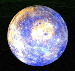
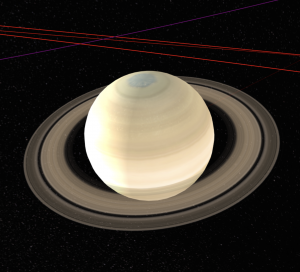
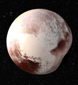
You can explore the meteoroid’s final days before impact here. As an added bonus, you can also zoom in on the individual planets and our Moon to inspect their surfaces. In most cases, the surfaces are actual images taken by spacecraft. Below are Mercury, Saturn, and Pluto.
Using our interactive visualization as a template, we also created a video of the meteoroid’s orbit, complete with captions, a close up of the meteoroid (we took some artistic license here), and a cameo of Mars.
Touch the Universe – 3D Printing + Visualization
Coming Soon!
Stellar Near Surface Shear Layers
Coming Soon!
Convection and Flux Emergence in Fully Convective M Dwarfs
This set of images and movies correspond with the very first simulations of flux emergence in the interior of a fully convective M dwarf, documented in Weber & Browning 2016 and Weber et al. 2017 using the thin flux tube (TFT) approximation. These visuals were all created using VAPOR, a visualization and analysis platform developed at the National Center for Atmospheric Research (NCAR).
Movie 1: Giant cell convective flows from a 3D simulation of fluid motions representative of a fully convective 0.3 solar-mass, main sequence star rotating at the solar rate computed through the Anelastic Spherical Harmonic (ASH) code. The radial velocity field is shown, with the blue tones representing strong downflows and red tones representing strong upflows. Each frame is separated by about 1.3 days of evolution, with only the Northern hemisphere shown. These flows advect flux tubes in the simulations of Weber & Browning 2016 and Weber et al. 2017, promoting buoyantly rising structures that may be progenitors of starspots. The duration of the video is about 130 days.
Movie 2: Movie of a flux tube rising through the interior of a fully convective star. It is speculated that magnetic structures such as these may give rise to visible starspots on stellar surfaces. Time-varying flows modulate the initially toroidal flux tube. Strong downflows pin portions of the tube to deeper layers, while strong upflows may boost portions toward the surface. The flux tube is colored according to its magnetic field strength, with bluer tones representing stronger magnetic field and yellower tones representing weaker magnetic fields. The convective radial velocity field is also shown. Only a portion of the Northern hemisphere is depicted, from the equator to half of the stellar radius in the vertical direction. Each frame represents about 1.3 days of evolution, with the video elapsing about 110 days. The video ends once the fastest rising portion of the flux tube reaches 95% of the total stellar radius, where the simulation terminates. The orientation has been rotated such that the fastest rising loop appears in the center of the visualization domain near the equator at the end of the movie.
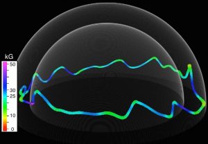
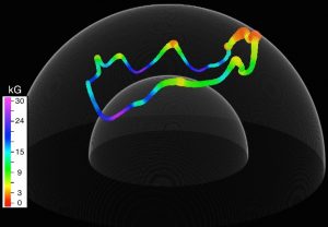
Images: Representative magnetic flux tubes, rendered once some portion has reached the simulation upper boundary at 95% of the total stellar radius. These images correspond to Figures 9d and 9a of Weber & Browning 2016, respectively. Each tube has an initial magnetic field strength of 30 kG and latitude of 5 degrees, with the leftmost tube originating at 75% of the stellar radius and the rightmost at 50%. The flux tube is colored according to the local magnetic field strength, and is given a 3D extent according to the local cross-sectional radius. As the flux tube evolves, convective motions modulate the shape of the initially toroidal ring, promoting buoyantly rising loops. The leftmost tube is also the same as depicted in Movie 2.
Trying out Houdini
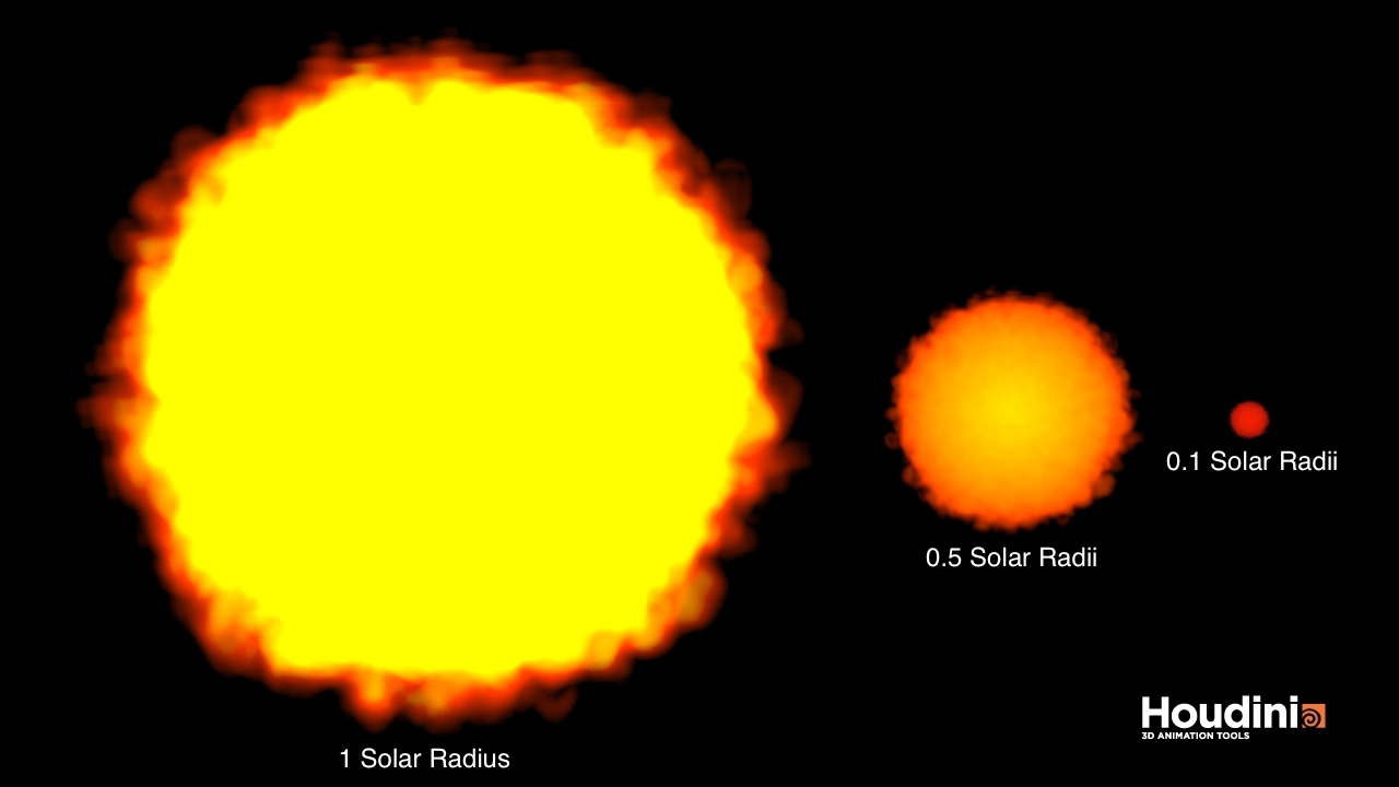
This image was my first attempt at trying out Houdini to do 3D volume rendering. Houdini is a 3D animation software package often used for Hollywood movies. I used the free version called Houdini Apprentice, and followed various tutorials here for using Houdini with yt. yt is a python package for analyzing and visualizing volumetric data.
To make this image, I imported a 3D volume to Houdini that was essentially a cube filled with non-zero values to represent a ‘fuzzy sphere’. Then I practiced creating custom color tables and transfer functions to represent a solar-like star, a late K dwarf, and a fully convective M dwarf. I scaled the volumes to 50% and 10% of the original size to create the smaller ‘stars’. But in this image, the sizes as they appear aren’t quite right. The smaller stars are offset from the ‘Sun’ some distance in the background, making them appear smaller than they should be in comparison. This ‘should’ be a quick fix (I’ll update it when I get a few spare minutes).
